


In today’s digital age where users access websites on a multitude of devices, responsive web design has become a necessity of building successful online experiences. With the ever-increasing variety of screen sizes and resolutions, it’s essential to ensure that websites adapt seamlessly to provide optimal user experiences.
According to a report by StatCounter, mobile devices once accounted for more than 56% of global website traffic in July 2022. Additionally, Google’s mobile-first indexing approach emphasizes the importance of responsive design for ranking and visibility.In this blog, we’ll explore the concept of responsive web design, its importance, key principles, best practices, and future trends.
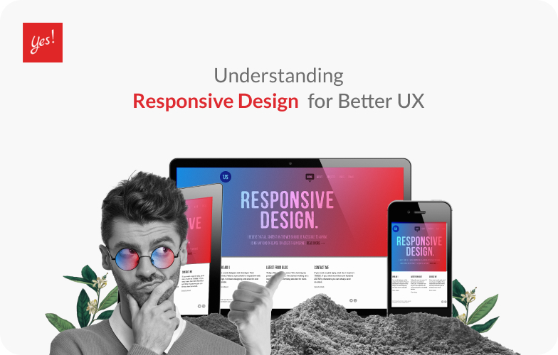
What is Responsive Design?
Responsive design is an approach that aims to create websites that automatically adapt and respond to different devices, screen sizes, and orientations. It involves designing and developing websites that automatically and dynamically adjust their layout, content, and functionality to provide an optimal viewing experience for users across desktops, laptops, tablets, and smartphones. By embracing responsive design, websites can provide a consistent and user-friendly experience regardless of the device being used. Here are some Key Principles of Responsive Design.
Key Principles of Responsive Design
- Fluid grids and flexible layouts: Responsive websites use fluid grids that allow elements to proportionally resize based on the screen size. Flexible layouts ensure that content adapts and reflows smoothly when the page is resized whether by manually resizing on desktop or changing devices.
- Media queries and breakpoints: Media queries enable the detection of device characteristics and allow for the application of specific CSS rules at different breakpoints, ensuring proper styling for each screen size. Media query is a technique known for using responsive design as it allows you to create distinct layouts depending on the size of the viewport.
- Responsive images and media: Optimizing images and media files for different screen resolutions helps reduce load times and enhance the overall performance of the website. Media plays a huge part in visually illustrating the message of the website. Having a good quality oriented media will ensure better user experience.
- Mobile-first approach: Designing for mobile devices first ensures a user-centric experience, considering the constraints and limitations of smaller screens, and then progressively enhancing the design for larger screens.
Importance of Responsive Design
Next, let’s look at some of the importance of Responsive Design and how it affects user experience(UX) and SEO(Search Engine Optimization). Responsive web design holds significant importance in today’s digital landscape for several reasons:
Enhanced user experience across devices
By providing a consistent and optimized experience on various devices, responsive design improves user satisfaction and engagement. Users can access websites seamlessly from their preferred device without encountering layout or functionality issues. With correct size and layout in every screen size, making users who browse from different aspect ratio receive the same experience.
Improved accessibility and reach
Responsive websites are accessible to a wider audience, including individuals with disabilities who rely on assistive technologies. Additionally, responsive design ensures compatibility across different browsers and platforms, expanding the reach of the website.
First and foremost, responsive design addresses the diverse range of devices and screen sizes that users utilize to access the web. With the proliferation of smartphones, tablets, laptops, and even smart TVs, it’s crucial for websites to be accessible and usable on different devices. By adopting a responsive design approach, websites can automatically adjust and optimize their layout, content, and navigation to fit various screen sizes. This ensures that users can easily interact with the website, regardless of the device they are using, enhancing accessibility for all users.
Moreover, responsive design eliminates the need for separate mobile and desktop versions of a website. In the past, websites would often have a separate mobile site with a stripped-down version of the content. This approach posed challenges for users as they had to switch between different URLs and experience inconsistencies in content and functionality. With responsive design, a single website can adapt and provide a consistent experience across all devices. This cohesiveness in design and content not only improves accessibility but also enhances user experience and engagement.
Responsive design also contributes to better usability and user satisfaction. Websites that are not optimized for different devices often suffer from issues like small text, overlapping elements, or difficult navigation on mobile screens. These usability challenges can frustrate users and lead to high bounce rates and low engagement. By implementing responsive design, you can create a seamless and user-friendly experience, enabling users to navigate, read, and interact with your content effortlessly. This improved usability ultimately translates into better user satisfaction and increased conversion rates.
Furthermore, responsive design aligns with the principles of inclusive design and accessibility standards. Inclusive design aims to create products and experiences that are accessible to all individuals, regardless of their abilities or disabilities.
Positive impact on SEO and search rankings
Another significant advantage of responsive design is its positive impact on search engine optimization (SEO). Search engines like Google consider mobile-friendliness as a ranking factor in their algorithms. Websites that are responsive and mobile-friendly are more likely to rank higher in search results, leading to increased visibility and reach. With responsive design, you can ensure that your website is optimized for search engines across devices, attracting more organic traffic and expanding your audience.
Search engines like Google prioritize responsive websites in search results because they provide a better user experience. Responsive design reduces bounce rates, improves engagement metrics, and enhances mobile-friendliness—all factors that influence search engine rankings.
Now, let’s take a look at some of the best practices in order to create a responsive web design.
Best Practices for Responsive Web Design
- Prioritizing content and functionality
- Ensure that essential content is easily accessible and visible across different devices.
- Consider the hierarchy of information and adjust it based on screen size.
- Condense navigation menus and provide intuitive mobile-friendly navigation.
- Clear path of navigation that user can easily browse through while easily search for what they are looking for
- Optimizing navigation and user interactions
- Implement touch-friendly elements, such as larger buttons and interactive components that are noticeable.
- Utilize and apply collapsible menus or off-canvas navigation for smaller screens to save space for the lost in screen sizes.
- Design clear and visible calls-to-action to guide users effectively turning them into potential customers.
- Ensuring fast loading times and performance
- Optimize image sizes and formats for different screen resolutions.
- Minify CSS and JavaScript files to reduce file sizes and improve loading speed.
- Leverage browser caching and content delivery networks (CDNs) for faster content delivery.
- Testing and refining responsive designs
- Conduct thorough testing across various devices and screen sizes to identify and address any issues.
- Use browser developer tools and responsive design testing tools to simulate different viewports.
- Collect user feedback and make iterative improvements based on user behavior and preferences.
Conclusion
Responsive web design is no longer a luxury but a necessity in today’s digital landscape. By adopting responsive design principles and practices, websites can provide optimal user experiences across a range of devices, improve accessibility, and positively impact search rankings. As technology evolves, staying informed about emerging trends and best practices will ensure that your website remains competitive and user-friendly in the ever-evolving world of digital experiences.
Remember, the success of responsive web design lies in its ability to prioritize users’ needs, adapt to their devices, and deliver exceptional experiences on every screen. Embrace responsive design, and unlock the potential to reach and engage your audience effectively.
Yes Web Design Studio
Tel. : 096-879-5445
LINE : @yeswebdesign
E-mail : info@yeswebdesignstudio.com
Facebook : Yes Web Design Studio I Web Design Company Bangkok
Instagram : yeswebdesign_bkk
Address : 17th Floor, Wittayakit Building, Phayathai Rd, Wang Mai, Pathum Wan, Bangkok 10330 (BTS SIAM STATION)


