

Within these few decades, the Internet has become a part of our daily lives and it is deeply ingrained into what and how we do things. Before, the internet was used by governments to share information across devices using the same network. Now, it cannot be denied that the internet is used to do everything. From buying groceries, real-time messaging, to working and studying online.

What is more convenient is browsing the internet using a smartphone. We carry it with us everywhere we go. That is why over 90% of internet users access the internet via smartphones. When we want to know things, we use the internet. When we want to stream videos, we use the internet. Browsing the internet has never been easier and to take advantage of how many users visited sites from this tiny device, applying Mobile First Design approach is critical in 2023 and here are 5 reasons why:
- Google Index + Ranking in SERPs: Google
- Mobile Usage + Ease of Access
- Experience / Expectation
- Scaling
- Content Above Everything
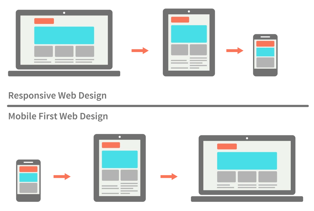
What is Mobile First Design?
Mobile-first design recognizes the shift in user behavior towards mobile devices as the primary means of accessing the internet. By starting the design process with a focus on mobile, designers ensure that the user experience is optimized for smaller screens, touch interactions, and varying connectivity speeds. This approach forces designers to prioritize essential content and functionality, resulting in streamlined and user-centric designs.
Why Mobile First?
One of the key principles of mobile-first design is responsive design. This means that the design should adapt and respond gracefully to different screen sizes and orientations, providing a consistent and intuitive experience across devices. By designing for the constraints of mobile devices first, designers can avoid the common pitfall of trying to fit a large-screen experience onto a smaller screen, which often leads to cluttered and confusing interfaces.
Google Index + Visibility in SERPs
The first reason is about the search engine itself, Google. As we know, Google made mobile-first indexing as a default, which means that Google tools such as PageSpeed will analyze and prioritize a mobile-friendly website and index first. This is why Mobile First Design should be something that is taken into account that it should deliver a good impression towards users as well as SEO efforts. In 2023 where the SEO game is highly competitive, the first and most important reason for asking how mobile first design helps with SEO is to make your website mobile-friendly.
Another reason following from the previous one saying that Google made mobile-first as a default in choosing what to put on is doing mobile-first design helps improve visibility on Search Engine Result Pages. Every website would certainly want to be on the search list when users search on Google and one thing that can help is to approach mobile design first.
Mobile Usage + Ease of Access
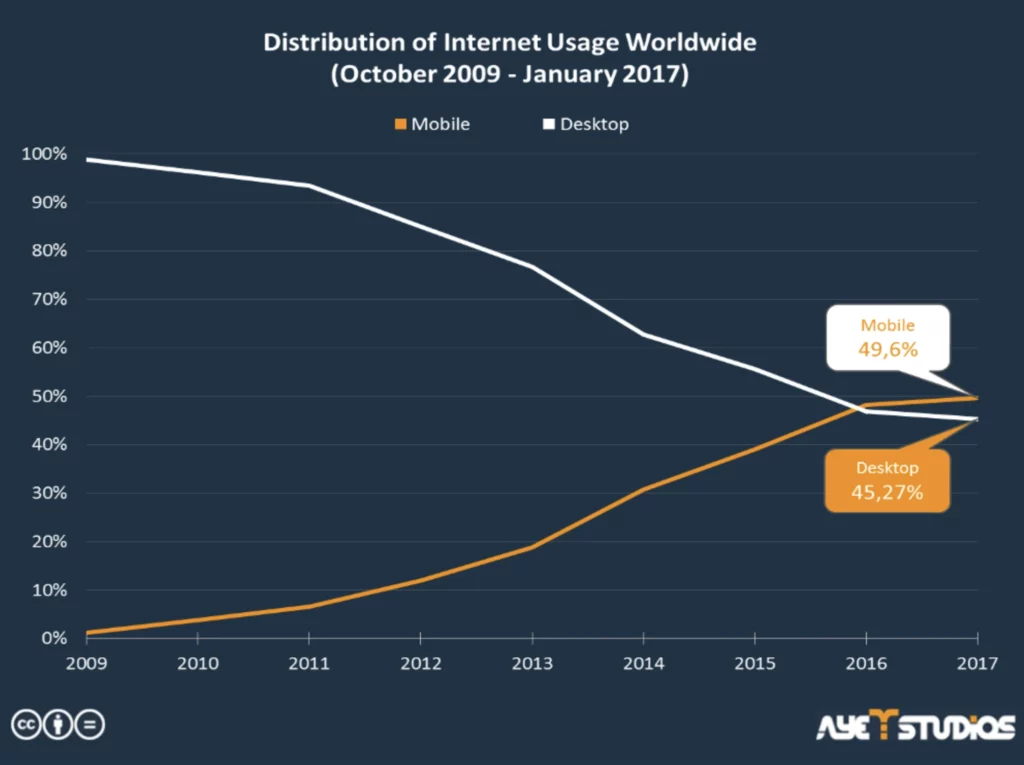
Another clear reason why Mobile First design plays an extremely huge role in contributing in 2023 is because of how many people browse the internet via mobile devices. As mentioned in the introduction, over 90% of the internet users access it from smartphones. Looking at the graph provided below, it can be seen that in 2017, Internet usage via mobile devices have already surpassed desktop devices such as notebooks or PCs.
Ease of Access is the cause of why mobile devices are so popular. It allows users the ability to search and explore the internet without having to carry a PC or a notebook. This ease of use in mobile devices is the advantage that it has among other devices although it possesses higher performances.
Experience / Expectation
We know from the last article about PageSpeed that only a split second delay can cause a bad impression towards users and that is because users have certain expectations of how a website should operate that is considered as good. As simple as it is, users just want a website that does its job. This is why focusing on the Mobile First Design approach will ensure that it works smoothly on the platform leaving a good impression towards the user. You don’t want to lose a potential customer just because of some minor design issues from your website.
Scaling
Another reason is Scaling, taking the mobile-first design approach means you are designing from the smallest screen. After that, scaling up to bigger screens will be more convenient as there is more space to occupy. On the other hand, if you design from larger screens, you end up having too many elements to put in smaller devices resulting in having to squish all those into smaller screens.
As a consequence, you will need to take minor fixes that an element doesn’t fit in properly or the button size is too big. Designing from smaller and building your way up to bigger screens is an upgrade but designing from large devices and going down may become a downgrade.
Having a Mobile-First Design ensures that your website looks fresh and friendly on cell phones.
Content Above Everything + Graceful Degradation
With small screens to work on, designing a website on mobile devices first means that the resource or content appearing will contain only the essentials to the service of that website, making customers not feeling overwhelmed by the information. Mobile-first design approach focuses on choosing the content wisely and effectively to make the most out of the smallest screen, placing valuable information and function at the center. It may be more difficult than the traditional or desktop-first approach but it will be well worth it if executed correctly.
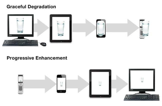
Starting the design using the traditional approach will make designers make use of the technology that is more advanced than smaller devices such as the hovering effect. After designers completed the design and wanted it to be compatible with mobile devices, they would need to cut those tweaks and functions resulting in lost cause. Using Progressive Enhancement or mobile first design forces designers to focus on the content and content only.
Conclusion
To sum it all up, the Internet has become a part of our lives and it is embedded deep into what and how we do things and with Google making mobile indexing as a default, the mobile-first design approach is essential in 2023 because of various reasons. With over 90% of internet users accessing from the mobile end and also surpassing desktop internet usage in 2017, it illustrates how mobile phones are and will be playing a huge role in how websites are designed.
Using this approach also ensures that the flow in smaller devices is streamlined better and doesn’t cause delays or minor issues that can extensively impact potential customers. As a result, the website becomes mobile-friendly with content-focused as well as user-focused.
Looking for a professional web design agency in Bangkok? Yes Web Design Studio delivers custom websites, SEO, and digital marketing for brands across Thailand. Get a free consultation today.
Looking for a professional web design agency in Bangkok? Yes Web Design Studio delivers custom websites, SEO, and digital marketing for brands across Thailand. Get a free consultation today.


