Clean and modern web design always be in trend. In this post, we will go through the elements of clean and modern website design that when combined, will create a website for your restaurant that your customers are guaranteed to love.
What does a clean design consist of?
Minimalism is to achieve simplicity. No customer wants to visit a website, get confused by the layout and leave.
The challenge of clean design is to maintain a minimalistic style while still keeping all the information that is necessary to a customer. Examples include the location, opening hours and the list of services they offer. For restaurants, this includes the kind of food you serve so you want to make it clear what kind of cuisine you offer and different options available. Most websites change their front page weekly or even every day to include an image of a special meal or offer.
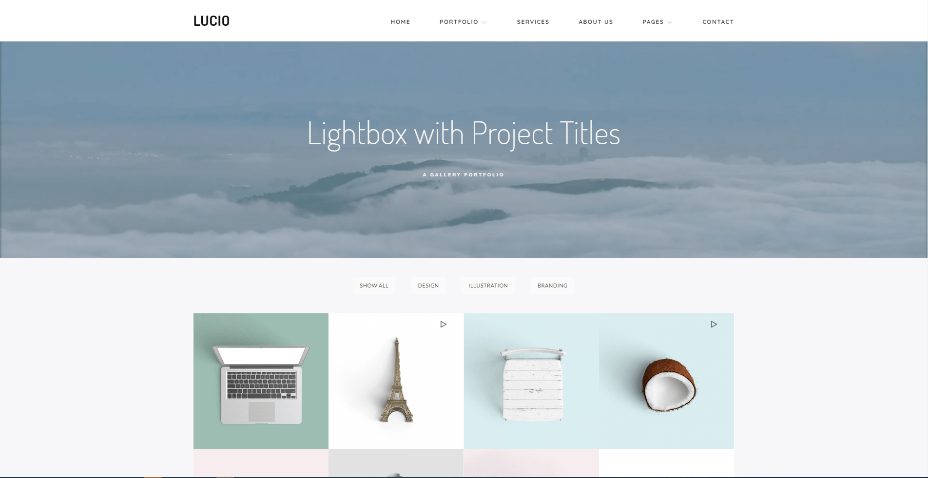
Elements of clean design
Whitespace
- Increase legibility, easier to navigate and read websites of any kind.
- It also helps redirect the attention of the customer to the things you want them to look at: the services you offer or any special deals you have going on at the moment.
- Instead of making images and fonts bigger, whitespace around them can make them stand out, as well.
Fonts
- The size of the font has always been used to indicate hierarchy, which one comes first or is more important than a previous part.
- Make sure that it matches your brand.
- Overly fancy fonts should be avoided because you want everyone to be able to read the text.
- When it comes to combining different fonts, you should never use more than three types.
Limited use of color
- Colors can often distract from important information, it is important to be subdued when using them.
- Using a monochromatic color palette to achieve a clean design.
- Use bright font colors on dark backgrounds and vice versa.
- Some even use these colors for backgrounds, which is a bold move that in some situations can look quite good, bright colors can add a lot of energy to a website, warm colors can do the same thing with the use of interesting shapes and graphics.
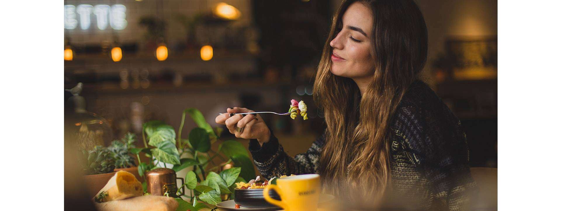
Image use
- Minimalism is all about clever image use. When we take a look at the previously mentioned examples, we can spot different image uses.
- Example: uses a photo of your food, using the black table as your whitespace in a way, and, while showcasing your food, leave enough space for all the text)
Responsive design
- Make sure that your restaurant’s website is responsive.
- Making a website have a nice appearance while maintaining good performance on all devices, no matter how big or small they are, includes having images and fonts that look good, according to the screen size.
Conclusion
- Today, it is almost necessary to have a website for your restaurant. It not only helps people find you but also offers them information about your business and gives them the option to order online or reserve their tables.
- It is important to have a website that is easy to navigate and looks good, so the minimalist option with the clever use of whitespace, fonts, images and colors is the right and best choice for your restaurant.