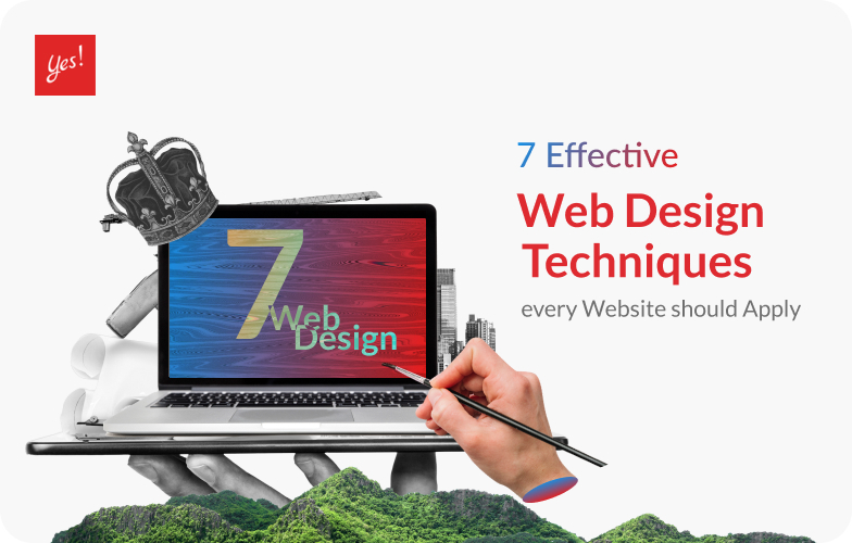
When we browse the internet and search for things, we want to make it easy. It would be disturbing to find a site that is unorganized. This is why business should execute effective Web Design Techniques in order to make your site more appealing.
What are Considered as Effective Web Design Techniques?
Web design is the foundation of websites that will determine how customers perceive your brand. The very first second a user clicks on your web, that is when they already make their first impression of your website. The font your content is in, the color palette you choose, everything on that website makes up an impression towards the user. This is why having a good Web Design Techniques will ensure that your site is appealing to visitors
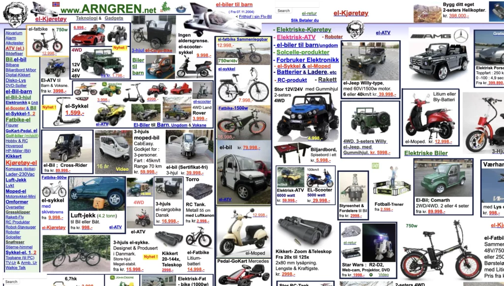
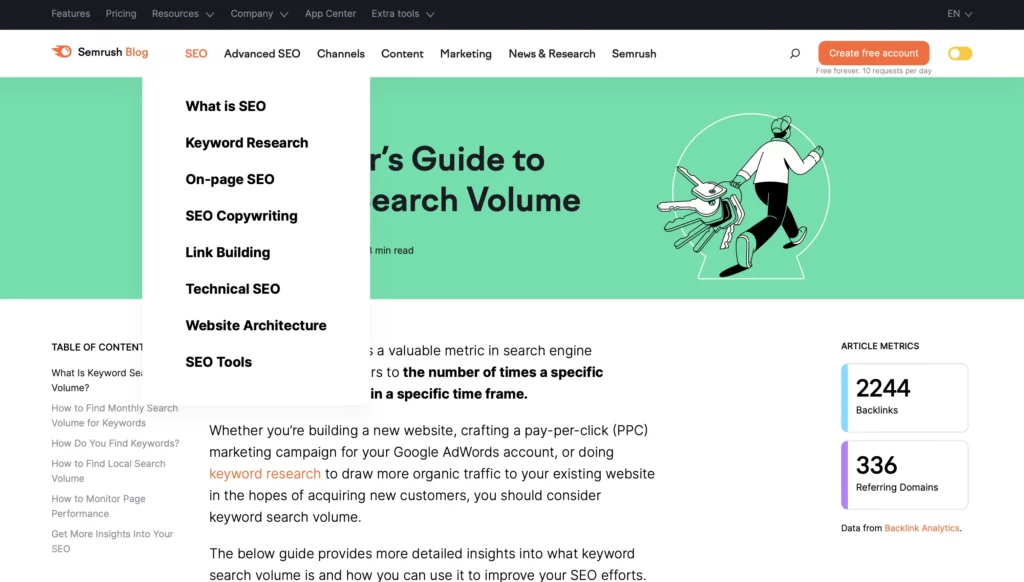
For instance, If a user launches a site and is immediately cluttered with piles of images all around their screen and the words are hard to read with a poor choice of background, the user may not continue browsing your site resulting in no sales. A good website should start with clear, attracting layout and navigation that eases the user’s experience. Here are some examples of bad and good web designs:
There are many different wed design techniques that websites use to create a satisfactory user experience. Here are 7 effective web design techniques that every website should apply:
Website Layout
Website Layout is a visual arrangement of the entire website. From text, image, graphic. It is how an image is placed at a certain space with text beside it or the relationship between two or more elements. In a wider range, it is the intentional positioning of every element that, as a result, forms a layout. The importance of layout is that it helps organize information in a way that readers can access information easily with a clear path of navigation. Layouts are also determined by the category of the website.
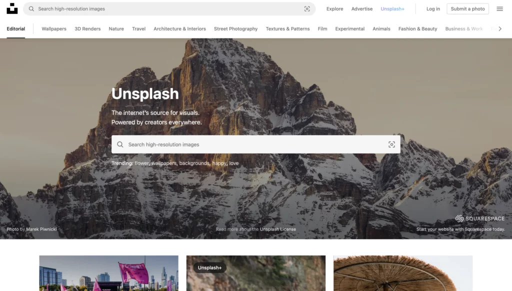
If the website focuses on promoting images like Unsplash, having categories at the top with the search bar can help users easily find an image they are looking for. Moreover, those who don’t know can browse the images below that are laid out down below. A good layout not only improves customer’s satisfaction but also helps how people perceive the brand.
Web Navigation
Web Navigation is how a user navigates through the website, from page to page. The ability to locate where some elements are usually placed is something many of us possess. For example, we know that a sign in/sign up or menu bar is most likely to be placed at the top right corner of the site.
However, a well designed navigation system should be accessible to all users, regardless of their abilities. This means that the navigation should be simple to use with clear labels and an easy-to-understand structure. Be aware that common sense in web navigation is only among those who have experience in web browsing that some adults may not have that same sense.
It is crucial that navigation bars or menus are clear with specific sub headings to give users more information so that they can easily locate information. Web Navigation also contributes to user experience. If the website navigates them to find information without any effort, that contributes to a positive user experience.
Fonts
Fonts are another essential element of web design. They can have a significant impact on a website’s overall appearance and effectiveness as choice of fonts can influence the website’s personality, improve readability, and create a visual hierarchy that guides users to valuable information.
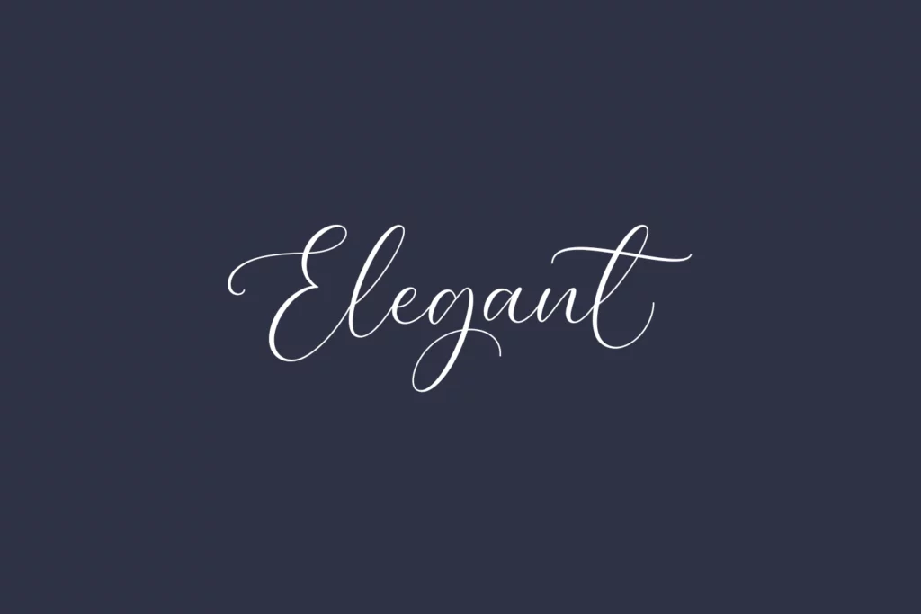
The personality of a website is displayed through selection of fonts used. For example, a luxury brand might use a sleek and elegant font, while a children’s website could use a playful and comic-style font. The font choice can also reflect the brand’s voice and message, such as a bold font for a sports brand.
Font selection is also crucial for readability. Font size, typeface, and spacing all contribute to how easily users can read and understand the content. Small or condensed fonts can be difficult to read, while large or widely spaced fonts may look unprofessional.
Finally, fonts can be used to create a visual hierarchy that guides users to important information. Difference in sizes, styles, and colours can be used to highlight key content, such as headlines and calls-to-action. This approach helps create a clear visual hierarchy, making it easier for users to spot on the website.
Typography
Typography in web design focuses on how letters and texts are arranged in a page. Good typography in web designs is clear and visually appealing to the reader. Typography defines the reader’s impression even before reading the text as how a set of texts are arranged can give different perspectives.
Typography in web design is created to maximize the impact of the message and there are many little details that need to be considered. From the baseline, height, serif, terminal, and many more. Typography can be very complicated but if executed correctly, it will result in effective communication. Changing how the paragraph is arranged can end up in a different feeling. Another importance of typography is that it can create distinction where content that is more important will have distinct characteristics – such as difference in color, size, fonts.
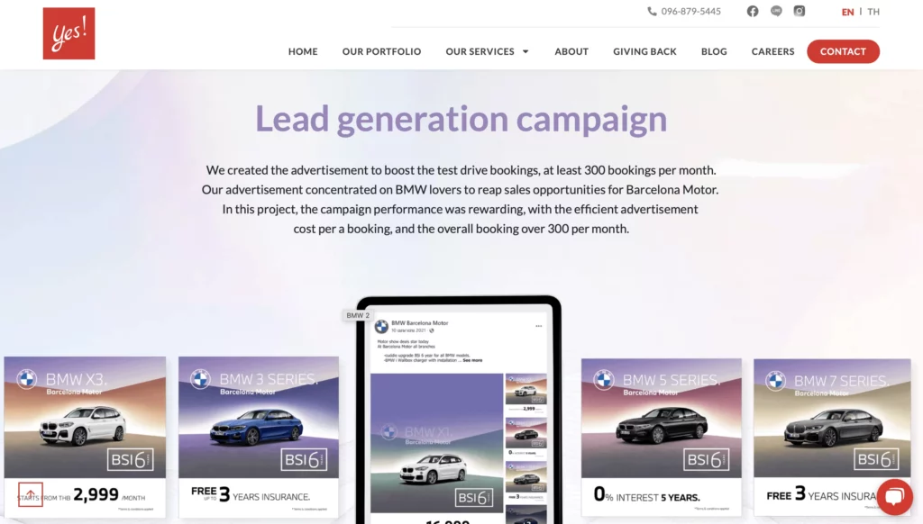
Take this image as an example. This is from our portfolio displaying our work that we did for BMW. You can see that The size or color of text indicates where users will look at first.
Color Palette
Color Palette in web design is considered one of the key elements to creating feelings when browsing the website. Color is a universal language and each of them associates with specific emotion that evokes when seen. Not only that it represents the brand identity, choosing the right color palette for each element could significantly alter how the user feels.
Warm colors – such as red, orange, and yellow give out a feeling of passion, anger, power, hunger etc. As for cool colors – such as blue, green, purple have the opposite with a feeling of calmness, relaxing environment.
Icons
Icon is another element that people often forget or don’t make use of. One of the advantages of using icons is that it visually conveys messages faster than text. Icons can break up long blocks of text and make the content more visually appealing. This can help improve readability and make the message more accessible to viewers.
Not only do icons serve as a way to pinpoint content easily so that users can find it without having to read through the texts, it can grab attention from users. Websites can design icons to align with their brand to establish brand identity. However, if the icon is unclear, it can obstruct the message leading to the user taking more time to find.
Call-To-Action
Call-To-Action is an interactive element that gives a sense of encouragement or urgency. What it means is that, after a user visits a website, there are some elements that present what the user should do next. CTAs can be used to encourage user engagement by providing a clear and compelling reason to take action. It can also be used to increase conversions by guiding users through the Sales Funnel.
By providing a clear and easy-to-follow path, businesses can make it easier for users to take the desired action and convert them into paying customers. Usually CTAs come in the form of Sign Up, Read More, Book Now, Call Now, Buy Now. A personal website could have a Mailing List Sign Up for those who visited the site and are eager to know more. A service website could have a pop-up message asking visitors to leave a message about their concerns.
In conclusion, these web design techniques are only a part of many more methods to improve the overall experience of the website. From Website Layout & Navigation that will improve user’s experience when browsing, Color Palettes that can help create certain emotions as well as representing brand identity, to CTA that encourages users by providing clear and compelling reasons to take action with an easy-to-follow path. With all these elements applied, your website will not only serve as information distribution but it will also reflect your brand identity positively.
Looking for a professional web design agency in Bangkok? Yes Web Design Studio delivers custom websites, SEO, and digital marketing for brands across Thailand. Get a free consultation today.
Looking for a professional web design agency in Bangkok? Yes Web Design Studio delivers custom websites, SEO, and digital marketing for brands across Thailand. Get a free consultation today.