
Choosing colors may sound easy, just choose colors that are appealing and beautiful. However, it’s not like that when there are millions of combinations of colors that humans can perceive and each of them conveys meanings and emotions that we unconsciously have no idea how much impact it has on our lives. Selecting what brand color palette we want to use in our brand can determine how customers view our brand identity.
There are several examples of logos and palettes that we can examine using famous companies. Take Starbucks for instance, the company decided to use the color green as their primary color in logos and design language. The color evokes a sense of connection to nature, with natural coffee bean products. Green color also symbolizes wealth. Combining the color green that holds a specific meaning with their identity, the color green now helps support their brand identity and values.
One might think that the green color in Starbucks logo isn’t that influencing, however, many of us who bought their products want more than just the coffee but also what the brand represents, wealth.
A brand that symbolizes luxury and indulgence might choose gold or silver to convey a sense of richness and exclusivity. The colors chosen should be consistent with the brand’s overall message and personality in order to create a cohesive and memorable brand identity.
In this article, we will be looking at some brand color palettes that are used in brands and what it symbolizes along how famous brands execute colors in their branding.
What is Your Brand Identity?
The first question that needs to be asked before choosing any color is how do you want your customers to feel when seeing your brand, what identity do you want your brand to express to the world. Is it calming or energetic, hope or loyalty, Security or excitement, Technology or Natural. These are the things that need to be carefully selected in order to create a clear brand identity.
- Define Brand’s Values, Missions: Finding what your brand represents, what it stands for, what makes the brand unique. These things should be reflected in your identity
- Understanding Audience: Know exactly what your customer wants from your company and know what the brand wants to share with the world.
- Develop Brand Personality: Create a distinct voice, taste, style to create a strong perception towards the brand as brand personality can help customers visualize brand identity.
Aligning Brand Identity with the Meaning of Colors
After defining the brand’s values and visions, the next step is to find colors that match with what the brand represents. Good selection of color will make customers have a stronger view on where the brand stands and its vision. Here are some example of colors and their meanings:
Red Brand Color Palette
The color red represents energy, passion, and excitement. This is why Netflix uses red for their logo on a black background to create cinematic visuals that present its premium streaming services. Red however, if used in brands correlated with security or loyalty will oppose the identity since red could symbolize aggression and anger. Examples of brands that utilize color red are:
- Netflix,
- YouTube
- Lego
- KFC
- H&M
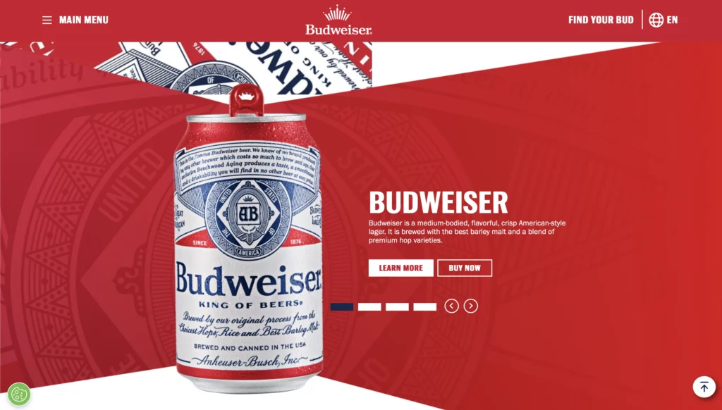
- Budweiser
These brands have one similar identity and it is the excitement. Imagine these brands in yellow or green, it would disrupt their whole personality of the brand.
Yellow Brand Color Palette

Yellow is a color of happiness. It is a common sight that we see a yellow smiling face. That is because the color represents happiness, hope, upbeat, cheerful, playful. Brands that applied yellow in their brand want to convey a sense of pleasure and enjoyment. Fast food companies like to combine yellow with red to trigger stimulation, appetite, hunger as many fast food chains euse these colors to promote their brand. One thing that the color is similar to red is that it opposes safety and responsibility. Examples of brands are:
- Snapchat
- Post-it
- Nikon
- National Geographic
- Chupa Chups
- Lipton
- Mcdonald’s
Blue Brand Color Palette

Blue on the other hand, are used in many big brands that are well known for trust, loyalty, security, and responsibility unlike red and yellow that lean more towards playfulness. Color blue has a very clear identity that represents trust and safety. Examples of brands that uses blue are:
- IBM
- Goldman Sachs
- American Express
- Visa
- Bank of America
- Mckinsey & Company
- Samsung
These brands have a reputation of safety that they need to portray thus using the color blue enhances that image very well.
Green Brand Color Palette

A brand that promotes environmentalism and agriculture might choose green as its primary color to symbolize growth, harmony, luck, health and balance. Green color can be associated with nature, trees so when seen in brands will give a sense of eco-friendly. Some of the well known banks take advantage of the color that is recognized as prosperity, wealth, and also security. For brands that are concerned with nutrition, food, or health will also use the color to promote a healthy persona. Some of the examples are:
- Spotify
- Holiday Inn
- Land Rover
- Fidelity
- TD Bank
- Tropicana
- John Deere
- Rolex
Consistency
After finding the right color, try to apply that color into all of the designs of the brand as consistency is key when it comes to brand identity, and this applies to the use of colors as well. Once a brand color scheme has been chosen, it should be used consistently across all design materials, from the website to social media profiles to business cards. This consistency creates a strong visual identity and helps reinforce the brand message and values.
Inconsistency, on the other hand, can confuse customers clouding brand’s values. For example, using different shades of the same color or using different colors altogether can create a disjointed visual identity that doesn’t align with the brand’s vision and message. This can later cause lack of trust and can ultimately harm the brand’s reputation.
Conclusion
In conclusion, each color holds meaning through its associations with emotions, symbolism, and its influence on our behavior and perception. This is why understanding the psychology of color is crucial when it comes to finding the perfect color for your brand, as it can help businesses to communicate their message and values visually effectively.
Consistency in color usage helps to create a strong visual identity that is easily recognizable and memorable, and also builds trust with customers. It is important for businesses to establish clear brand guidelines for color usage and ensure that these guidelines are followed consistently throughout all marketing and design channels.
You Might Also Like
- Understanding Eyes Movement in Web Design
- Give your website a makeover with the right colour schemes
- Must Know Figma Plugins and Techniques for Beginners
Looking for a professional web design agency in Bangkok? Yes Web Design Studio delivers custom websites, SEO, and digital marketing for brands across Thailand. Get a free consultation today.
Looking for a professional web design agency in Bangkok? Yes Web Design Studio delivers custom websites, SEO, and digital marketing for brands across Thailand. Get a free consultation today.