Short answer: A design system succeeds or fails on adoption, not on how complete it looks. What changed by 2026 is that it now feeds three audiences instead of one: designers, developers via Dev Mode and Code Connect, and AI agents reading your file through Figma’s MCP server. Naming and structure used to be a nicety; they’re now load-bearing.
Open any product file that’s been alive for two years and you’ll find the same thing: a primary button that exists fourteen times. Eleven are detached. Three have slightly different padding. Nobody knows which one is correct, so the next designer makes a fifteenth.
That’s the problem a design system solves. Not “consistency” in the abstract — that specific, recurring, expensive mess.
The Figma design system serves as a centralized hub for designers and teams to build and manage design assets on. It enables the creation of reusable components, such as buttons, icons, and typography styles, which can be easily accessed and implemented across multiple projects. This promotes design consistency and efficiency, as changes made to a component are automatically reflected everywhere it is used.
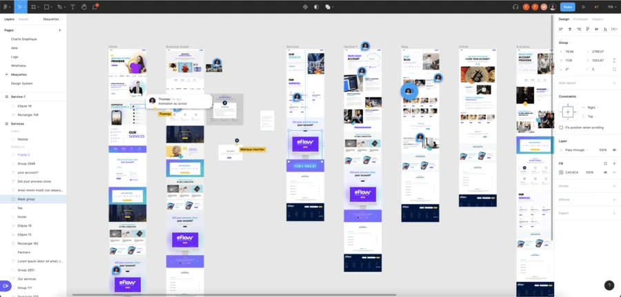
A key advantage of the Figma design system is its cloud-based nature. It allows real-time collaboration where multiple designers can work simultaneously on the same project, making it ideal for distributed or remote teams. The platform also offers version control and history tracking, ensuring that designers can revert to previous iterations if needed and maintain a seamless workflow.
Another advantage of Figma is its extensive plugin ecosystem that provides a wide range of plugins that enhance the functionality and capabilities of the design tool. These plugins are created by both Figma and third-party developers, offering an extensive library of tools and features to customize your design workflow. The plugin ecosystem allows designers to extend the capabilities of Figma, streamline their processes, and explore new creative possibilities.
Maintaining Design Language using Figma Design System
The Figma design system empowers designers to create design libraries, where they can organize and categorize components for easy reference and reuse. It supports interactive prototyping, allowing designers to create clickable prototypes and demonstrate user interactions. Additionally, Figma’s developer handoff features enable seamless communication between designers and developers, ensuring a smooth transition from design to development.
Maintaining a consistent design language is crucial for creating a cohesive and polished user experience, and Figma provides powerful tools to help you achieve just that. From creating reusable components and defining global styles to collaborating with team members and managing design updates, we’ll cover everything you need to know to keep your design language intact and ensure a seamless experience for your users.
Let’s dive in and discover how Figma can empower you to maintain a strong and unified design language throughout your design projects.
Establishing Figma Design System Management
Set a solid foundation — start with variables, not components
The instinct is to start by drawing buttons. Resist it. Start with the values those buttons will reference.
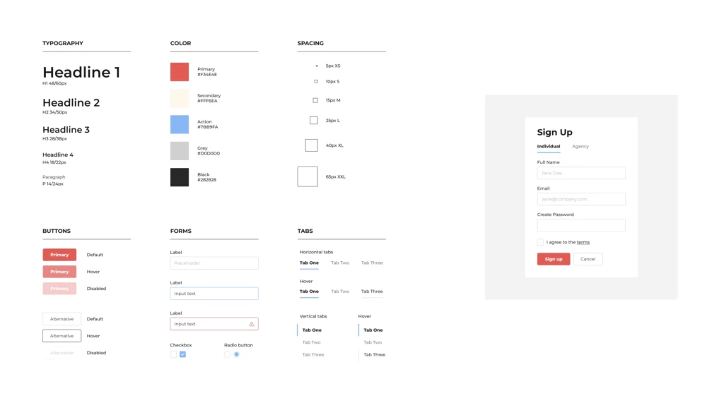
Figma variables come in four types: colour, number, string, and boolean, and they live in collections. A collection holds up to 5,000 variables, which is far more headroom than most teams will ever need, so organise for clarity rather than economy.
A structure that holds up:
Primitives — the raw palette and scale. blue-500, space-8. These are named after what they are.
Semantic tokens — what those values mean. surface-default, text-critical, space-inline-sm. These reference the primitives.
Components should only ever consume semantic tokens. When the brand shifts, you change the mapping in one place instead of hunting through 200 components.
Here’s the naming convention we use, in full. It isn’t the only workable one, but it’s specific enough to argue with which is more useful than a vague instruction to “use clear names”:
Layer
Pattern
Example
Rule
Primitive colour
{hue}-{step}
blue-500, neutral-100
Never referenced by a component
Semantic colour
{role}-{variant}
surface-default, text-critical, border-subtle
The only colours components may use
Spacing
space-{size}
space-2, space-8
Numbers map to a 4px base scale
Radius
radius-{size}
radius-sm, radius-full
Sizes, not pixel values
Component
{Component}/{Variant}/{Size}
Button/Primary/Large
Slashes create folders in the assets panel
Two rules that do most of the work: primitives are named after what they are, semantic tokens after what they’re for. If you can’t decide which layer a token belongs in, it’s usually because it’s doing both jobs split it.
Modes are why this matters. One collection holds multiple modes light and dark, compact and comfortable, brand A and brand B and a frame switches between them without duplicating a single component. It’s the biggest change to Figma design systems since 2023.
One practical note: publishing variables to team libraries and using them in prototypes require an education or paid plan, and modes per collection vary by plan. Check your limits before you architect a multi-brand system around them.
A trap worth naming: teams often build a beautiful primitive layer and then let designers pick primitives directly because semantic names feel like extra work. Six months later, the theme switch doesn’t work, and nobody knows why. If you build the semantic layer, enforce it.
Organise design assets so people can find things without asking
A design system that needs a Slack message to navigate is not a design system.
Naming does double duty now: a slash creates a folder in the assets panel, and the same name shows up in Dev Mode and gets read by AI agents. Button/Primary/Large costs the same to type as btn primary lg and is worth considerably more.
Use component properties and variants rather than shipping separate components for every state. One button with properties for size, state, and icon beats twelve near-identical buttons, and it means a change lands everywhere at once.
The file structure that works for most teams — copy this as a starting point:
Build collaborative workflows — and decide who says no
Figma makes commenting and sharing effortless, which is exactly why teams skip the harder question: who decides what enters the system?
Someone has to be able to say “not yet”. Without that, the library becomes a landfill of one-off components contributed with good intentions. It doesn’t need to be a heavyweight one-reviewer and four questions cover most teams:
Does this already exist, possibly under a different name?
Will it be used in more than one place?
Does it use semantic tokens rather than hard-coded values?
Does it have a name someone else would guess?
Two minutes, and it prevents most of the mess. Add a monthly half-hour review of what’s been added, and you’ll catch drift while it’s still cheap to fix.
Use version control properly — branching, not just history
Version history tells you what a file looked like last Tuesday. Branching lets you make a substantial change without breaking everyone downstream while you work.
For anything touching multiple components a spacing revision, a colour migration, a component API change work in a branch, get it reviewed, merge. Treat it like a pull request, because that’s what it is.
Deprecation is the part everyone skips. Deleting a component breaks live files, so most teams leave the old one there forever.
Better: rename it with a [Deprecated] prefix, note what replaces it in the description, leave it published for one release cycle, then remove it. People need a window to migrate and they need to be told the window exists.
Document where the work happens
Design system documentation fails predictably: it lives in Notion, it’s three months out of date, and nobody opens it.
Put the short version where it’s already visible. Component descriptions show on hover and in Dev Mode: one sentence on when to use a component, and when not to. The “when not to” half is what actually prevents misuse.
Use annotations in Dev Mode for what visual design can’t express: error behaviour, empty states, which spacing is intentional versus incidental.
Keep a longer doc only for what genuinely needs prose: contribution rules, naming conventions, the reasoning behind decisions and link it from the library file’s cover page.
The test: a new designer ships something correct in their first week without asking a question that’s already answered.
Maintain it — or accept that it will rot
Design systems don’t fail loudly. They decay quietly, one detached instance at a time, until people work around them faster than they work with them.
Schedule a real audit quarterly. What to look for:
Detached instances. A component being detached repeatedly is not a discipline problem; it’s a design problem. Find out what people needed that the component wouldn’t do.
Unused components. If your plan includes library analytics, use them. Components with near-zero insertions are a maintenance cost with no return — remove them.
Hard-coded values that should be tokens.
Near-duplicates that crept in around the review process.
Ask the people using it what slows them down, and expect the answer to be about your system rather than about them. Detachment is feedback.
Scale with governance that matches your size
Governance sounds like bureaucracy. It’s really three decisions: who maintains the system, how contributions get in, how changes get communicated. Match the model to the team:
Team size
Model that usually works
1–5 designers
One owner, informal review, documentation in file descriptions
5–20
Named maintainer with allocated time, contribution checklist, release notes
Small teams over-engineer — a contribution process heavier than the team it serves. Large ones do the opposite: a system maintained by whoever has spare time, which means nobody.
For multi-brand work, modes are the mechanism. One component set, several brand modes, one source of truth — genuinely better than forking the library per brand and watching them diverge.
Code Connect is the last mile. It maps your Figma components to the real components in your repository, so Dev Mode shows engineers your actual code instead of a generated approximation and gives AI coding agents accurate references through Figma’s MCP server.
It supports React and React Native, HTML-based frameworks including Web Components, Angular and Vue, SwiftUI, and Jetpack Compose, and integrates with Storybook. It requires an Organization or Enterprise plan and a Full or Dev seat, so it isn’t for everyone, but if you’re on those plans and haven’t set it up, it’s the highest-leverage afternoon of work available to you.
Where to start if you’re starting today
Not all seven at once. In order:
Audit what you have. Count the buttons. The number is usually worse than expected, and it makes the case for you.
Build the variable layer — primitives, then semantic tokens. Nothing else until this is done.
Migrate the ten most-used components to consume tokens. Ten, not all of them.
Ship it and let people use it. A small system in use beats a comprehensive one in progress.
Add governance when it starts hurting — not before.
The most common way a design system dies is being built to completion before anyone is allowed to use it. By the time it’s ready, the product has moved, and the team has built its own workarounds.
FAQ
Should we use variables or styles? Variables for anything with a value: colour, spacing, radius, sizing. Styles still make sense for text and effects, where they remain the practical option. Most teams end up running both, and that’s fine.
How many components does a design system need to be useful? Fewer than you think. Button, input, select, checkbox, card, modal, and a type scale will cover the majority of screens in most products. Ship those, then add based on what people actually ask for.
Do we need Code Connect? Only if you’re on an Organization or Enterprise plan and have a real component library in code. If you’re not, the equivalent value comes from disciplined naming: matching names between Figma and code gets you most of the way with none of the setup.
Who should own it? One named person, minimum. Shared ownership across a team with no designated owner reliably means no ownership at all.
Conclusion
If you take one thing from this: build the variable layer first, ship early, and put someone’s name on it.
Design systems rarely fail because the components were poorly drawn. They fail because they were built in isolation, launched as a finished artefact, then left to drift while the product moved on. The teams that succeed treat the system as a product with users, designers, engineers, and now AI agents, and optimise for those people picking it up, not for how complete it looks in a presentation.
Start with the button count.
Building a product and want the design system to hold up past launch? Talk to our team. We set up Figma libraries that teams actually use, and we’re happy to look at what you have first.
Nina Wongsakul is a digital marketing specialist and content strategist at Yes Web Design Studio in Bangkok. With expertise in SEO, web design, and AI-driven marketing, she helps Thai and international businesses build powerful online presences.