The Language Institute of Chiang Mai University (LICMU) entrusted Yes Web Design Studio with a task aimed at developing a professional and user-friendly website.
The objective was to create an engaging online presence that embodies the institute’s mission whilst facilitating language learning and cultural interaction.
Our team began the project by meeting often with the LICMU team to best understand what they wanted to achieve. We conducted research into the educational sector to effectively distinguish the needs of students, teachers, applicants and staff alike. A strong user journey was needed to effectively showcase the message of LICMU.
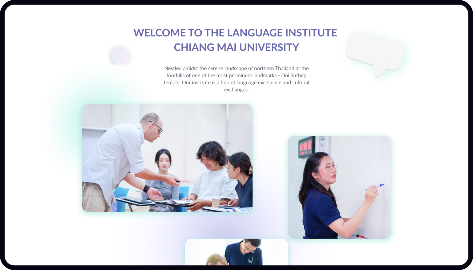
Making use of soothing pastel colors like purple and green, we wanted users to feel welcomed into a calming digital environment, much like the university itself. Furthermore, the appearance also had to be professional, which meant the interface had to present a look that was both attractive and functional. An educational institution must appear credible after all.
Although photos are a good for a quick and easy preview, we wanted something more visually engaging. Therefore, we added an introductory video straight to the hompage so first time visitors would be instantly transported into a virtual tour. People need to be immediately engaged if they are to continue exploring the website.
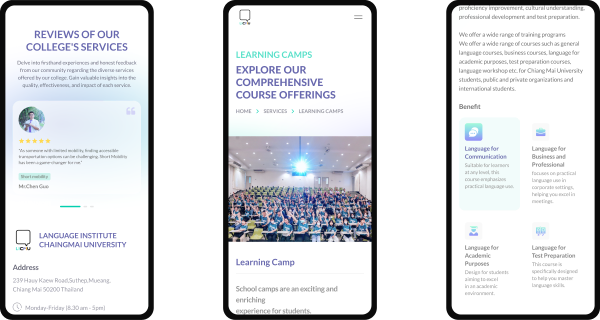
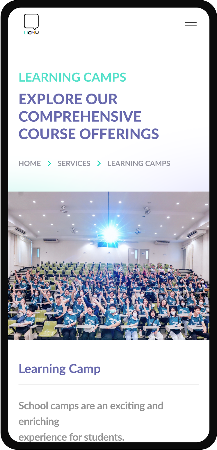
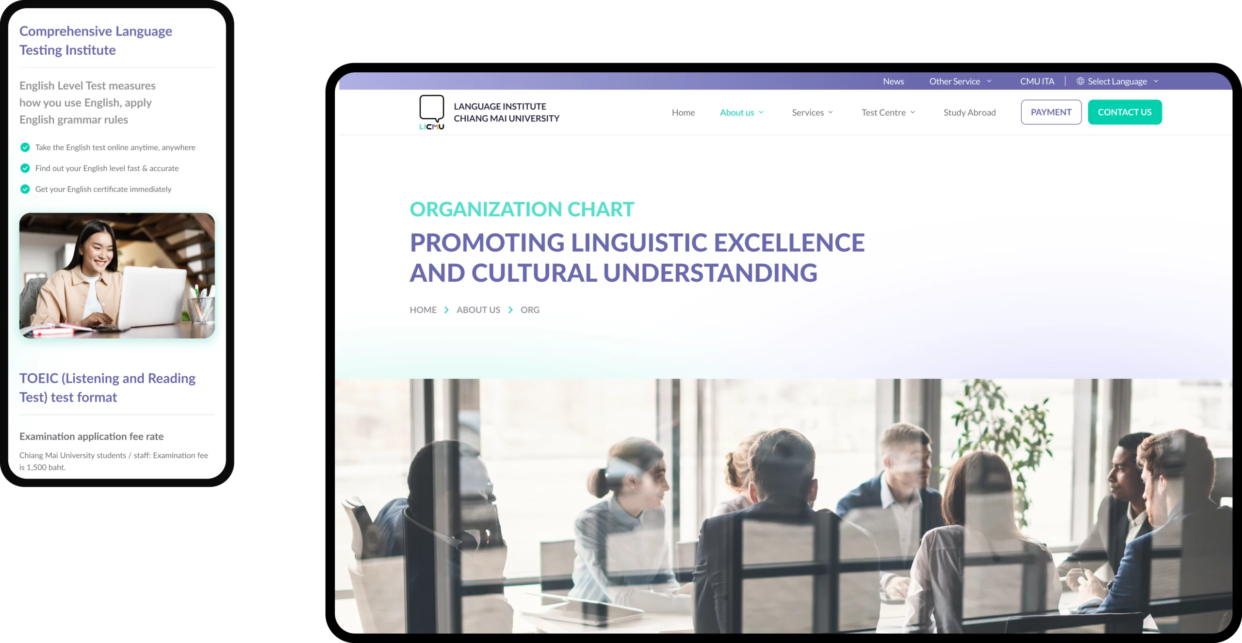
The website isn’t just a digital brochure – it’s an important extension of the university, serving as a hub for all its educational resources. Visitors need to be able to locate what they’re looking for, accurately and with ease. Therefore, our team developed their main menu to be straightforward, featuring the most prominent sections such as Services, Contact, News and Payment.
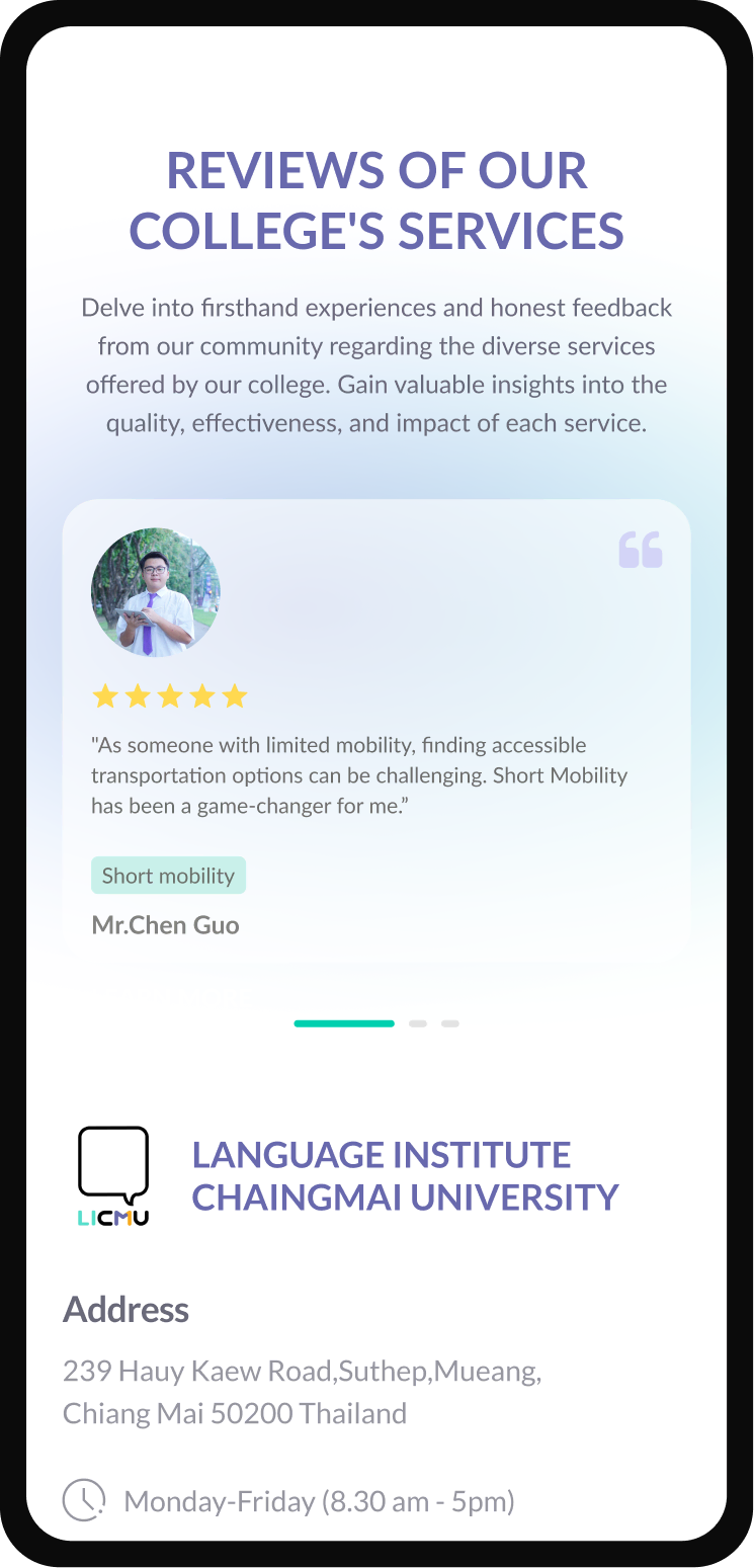
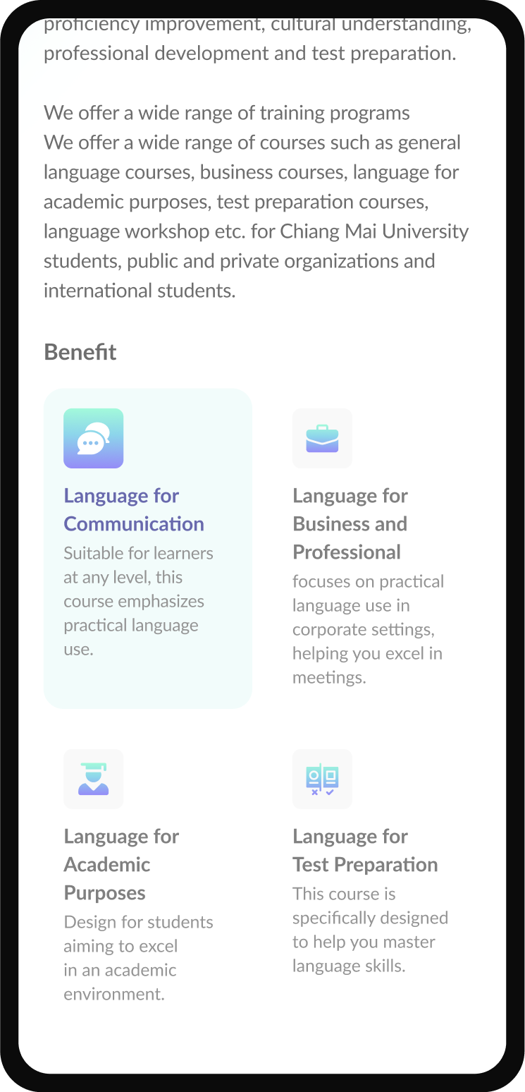
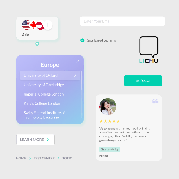
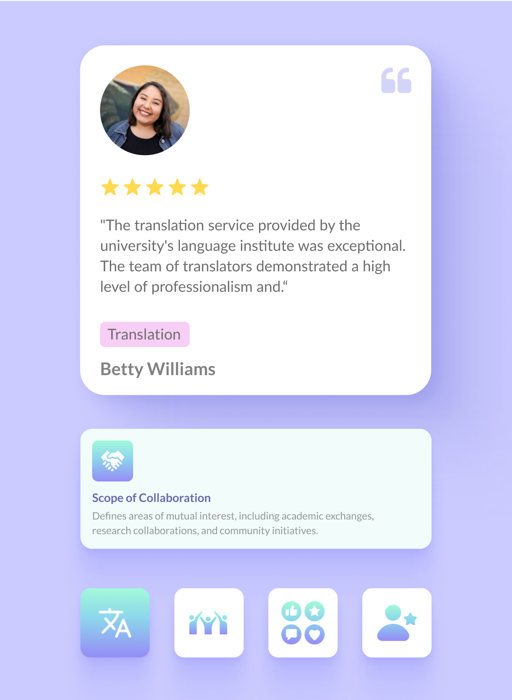
LICMU’s biggest selling point are their courses and how their institute can benefit students to hone their foreign language skills overseas. However, this needed to be backed up with highlighting their other key aspects such as their recent activities, events, student reviews and cultural exchange programs. All of these factors contribute to a credible and experienced brand image.
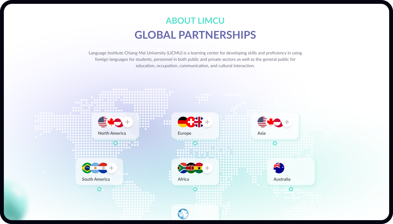
Every educational institution needs to highlight their connections and what they can bring to students on a global scale. Which is why our team dedicated an entire section to emphasize their international partnerships and collaborations, including information on MOU and MOA.
What good are aesthetics if there isn’t speed to match? We complimented the user journey experience with lightning fast loading times, so that visitors can quickly access all the relevant information and resources across all available platforms.
A professionally designed website is more than just a digital front, it’s a powerful tool for business growth. Improve your online visibility with a high quality website that clearly reflects your core values.