A good logo can attract your customers to finding out more about your brand or business. That’s why you’ll want your logo to look beautiful and attractive. However, a logo that looks appealing today may not be able to appeal to customers tomorrow. A lot of people are not aware of this and still stick to their old logo that has become obsolete. Therefore, you should keep up with the latest logo design trends and make your logo up-to-date all the time so that your logo will never be outdated and unable to attract customers.
Below are some of the most popular logo design trends in 2019 that we’ve noticed from providing graphic and logo design services in Bangkok, Thailand.

1. LOGOS THAT COME IN DIFFERENT VERSIONS
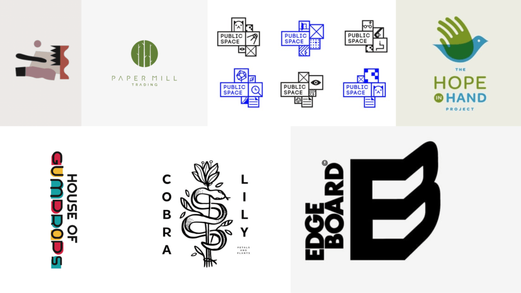
Even though this is the age where logos are shown on many platforms, brands don’t only care about how well their logos convert when appearing on a different platform but also how it can assist them in forming a better relationship with different groups of customers. A logo which is capable of doing that is a variable logo that adapts to the group they’re communicating with.
2. MODERN GEOMETRIC DESIGNS
Geometric designs used to be abandoned by people as they were too mathematical, formal, and emotionless. However, in 2019, many designers are using geometric logos with energetic colors and friendly components. This new trend aims to make logos with a geometric design look more playful and welcoming. “Mix bold geometric shapes with colorful palettes. Clean and minimal but strong,” advised Claudia C., a designer of 99designs which is an Australian company that provides a freelancer platform that connects graphic designers and clients together.
3. VISUALLY TRICKY LOGOS
This is one of the most popular logo design trends in 2019. The purpose of this trend is to ‘deceive the eye’ by making the logo look fragmented, twisted, bent, etc. Using tricky designs on a logo also keeps logo designers enthusiastic about logo design.
An example of a visually tricky logo can be seen in the EdgeBoard logo designed by Hampus Jageland. He mixed the letter E and the letter B from the company name together by making the letter B look like it is placed on a corner of a cube. By this way, if you look on the side of the cube where the first half of the letter B is placed, you will see the letter E, but if you look at both sides diagonally, you’ll see the letter B.
4. MEANINGFUL COLOR
Conveying a message through the use of colors is a creative strategy that logo designers use to build strong relationships with the customers. That’s why in 2019 designers often focus on the meaning of the color instead of its beauty and attractiveness when picking a color for their logo.
Take the logo used on greeting card aficionado House of Gumdrops designed by a 99designs designer, Bruno Vasconcelos, as an example. The colors he used on the logo represent the name of the company and also attract the majority of the company’s customers which is female. He revealed that he had got the inspiration to create these designs from the shapes and the colors of gumdrops.
5. CHANGE IN MINIMALISM
Minimalism has been one of the most important and the most popular logo design trends for quite some time. However, in 2019, designers are using more abstract concepts on their minimalist logos. These abstract concepts make minimalist logos become more effective.
An example of a logo that follows this trend is the Paper Mill logo designed by a 99designs designer, ‘robbyprada’. This logo leaves out unnecessary components and only consists of basic components including a monotone circle and a silhouette of three bare branch trees.
6. VINTAGE LOGOS
Using vintage logos has been a popular logo design trend for a long time and it’s getting bigger in 2019 as brands are aiming for classic logos that seem to have history although they have just been created. That’s why we’ll see a lot of logos that come with a classic design giving you vintage vibes in this year.
Take a look at the Cobra Lily logo designed by ‘extrafin’, a 99designs designer, as an example of a new age vintage logo. The logo expresses the brand’s history, trust, and experience really well. The designer of this logo said that he had wanted the logo to look original and simple and conform with trends such as stick and poke tattoos and nature drawings.
7. OVERLAPPING LOGOS
Overlapping logos is another popular logo design trend in 2019 where designers overlap shapes while playing with the opacity of those shapes. This trend also borrows the techniques from some other trends of this year including meaningful color, modern geometry, and negative space.
The Hope in Hand Project logo designed by Allan Peters, the owner and designer at Peters Design Co., is a great example of an overlapping logo. This logo is made up of a shape of a bird and a shape of a hand that overlap. The tricky part of this logo is the hand which can also be seen as the bird’s wing.
logo
CONCLUSIONS
To conclude, many logo design trends in this year such as geometric designs, minimalism, or vintage logos evolve from trends in past years. Therefore, if you’re trying to predict the upcoming trends, it may be best to not only keep up with today’s trends but also take a look back at those in the past
Are you struggling to create a trendy and attractive logo for your new brand? Or do you think that your brand’s current logo has become obsolete and needs to be redesigned? If so, have a professional web and graphic design company in Bangkok, Thailand take care of these problems for you is a smart move. So, don’t hesitate! Contact us now!
>> Source: https://99designs.com/blog/trends/logo-design-trends-2019/#geometry


